

In interior design, color is a key element that shapes the atmosphere of a space. PANTONE 15-1116 TPG, also known as “Cappuccino,” is a warm, muted gray-brown tone reminiscent of the rich and comforting hues of a creamy cappuccino. It is understated yet versatile, bringing a sense of coziness, elegance, and serenity to any room. This article explores how to incorporate Cappuccino into your home through bedding, color schemes, and design tips, helping you create a harmonious living space.
1. Choosing Cappuccino Bedding
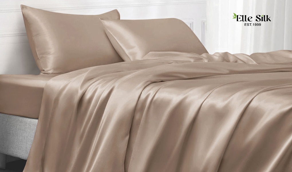
Cappuccino is an excellent choice for bedroom textiles, creating a tranquil and inviting environment. Here’s how to make it work:
Material Selection
- Cotton-Linen Blends: The natural texture of cotton-linen blends in Cappuccino tones exudes a relaxed, earthy vibe, perfect for rustic or minimalist styles.
- Silk: For a touch of luxury, opt for Cappuccino-colored silk bedding, which adds a sophisticated sheen and smooth texture to your bedroom.
Pattern Ideas
- Solid Color Simplicity: Pure Cappuccino bedding delivers a calm, cohesive look, ideal for minimalist spaces.
- Natural Patterns: Incorporate subtle leaf or wood grain patterns in Cappuccino tones to enhance a natural, grounded aesthetic.
- Contrasting Accents: Combine Cappuccino with geometric designs in soft gray or cream to add visual depth without disrupting the overall harmony.

2. Home Color Schemes Featuring Cappuccino
Cappuccino’s versatility allows it to blend seamlessly into various home styles, either as a primary shade or an accent. Here’s how to create balanced palettes:
Color Pairing Principles
- Monochromatic Layers: Combine Cappuccino with shades of beige, taupe, and dark brown for a serene, tonal gradient.
- Contrasting Colors: Pair Cappuccino with navy blue, forest green, or deep burgundy to create bold yet sophisticated contrasts.
- Accent Colors: Use warm whites, gold, or vibrant orange as accent tones to enliven Cappuccino-dominated spaces.
Color Scheme Examples
- Natural Comfort
- Base Color: Cappuccino for walls or curtains.
- Accent Colors: Olive green rugs, off-white furniture, and light wood flooring.
- Effect: A serene, nature-inspired atmosphere perfect for bedrooms or home offices.
- Modern Chic
- Base Color: Cappuccino for sofas or bedding.
- Accent Colors: Charcoal gray decor, black metal furniture, and warm white lighting.
- Effect: A contemporary, sophisticated aesthetic ideal for urban apartments.
- Classic Elegance
- Base Color: Cappuccino leather armchairs or upholstered furniture.
- Accent Colors: Deep burgundy rugs, brass fixtures, and walnut wood furniture.
- Effect: A rich, layered look with timeless appeal.
3. Furniture and Decor Pairing Tips
Furniture Ideas
- Wooden Pieces: Light oak or walnut furniture complements Cappuccino’s natural warmth, enhancing its earthy tones.
- Metal Accents: Furniture with gold, black, or brass details adds a touch of modernity and contrast to Cappuccino-based spaces.
Decor Suggestions
- Throw Pillows and Rugs: Use Cappuccino as the main color for throw pillows or area rugs, and layer with cream or dark gray for added texture.
- Curtains and Upholstery: Combine Cappuccino curtains with sheer white layers to balance lightness and warmth.
- Art and Wall Decor: Choose artwork or prints in neutral shades with Cappuccino accents for a cohesive, polished look.
4. Where Cappuccino Shines
Bedroom
- Use Cappuccino for bedding, curtains, or accent walls to foster a calming, restful environment.
- Pair with warm ambient lighting for a snug and relaxing space.
Living Room
- Incorporate Cappuccino sofas, throw blankets, or area rugs to create a welcoming yet stylish ambiance.
- Add greenery or ceramic decor pieces for a pop of vibrancy and texture.
Dining Room
- Opt for Cappuccino table linens or dining chairs paired with wood and metallic finishes to achieve a refined dining experience.
- Split wall designs featuring Cappuccino and white can make the space feel airy yet grounded.
5. Final Thoughts
PANTONE 15-1116 TPG (Cappuccino) is a timeless color that radiates warmth, subtlety, and sophistication. Its adaptability makes it a perfect choice for modern homes, whether used as the main color or as a versatile accent. By carefully selecting materials, pairing it with complementary colors, and layering textures, Cappuccino can help you create a serene, cohesive, and stylish home environment.
Whether your style leans towards natural simplicity, modern minimalism, or classic elegance, Cappuccino is the perfect foundation for a space that feels both timeless and uniquely yours.