
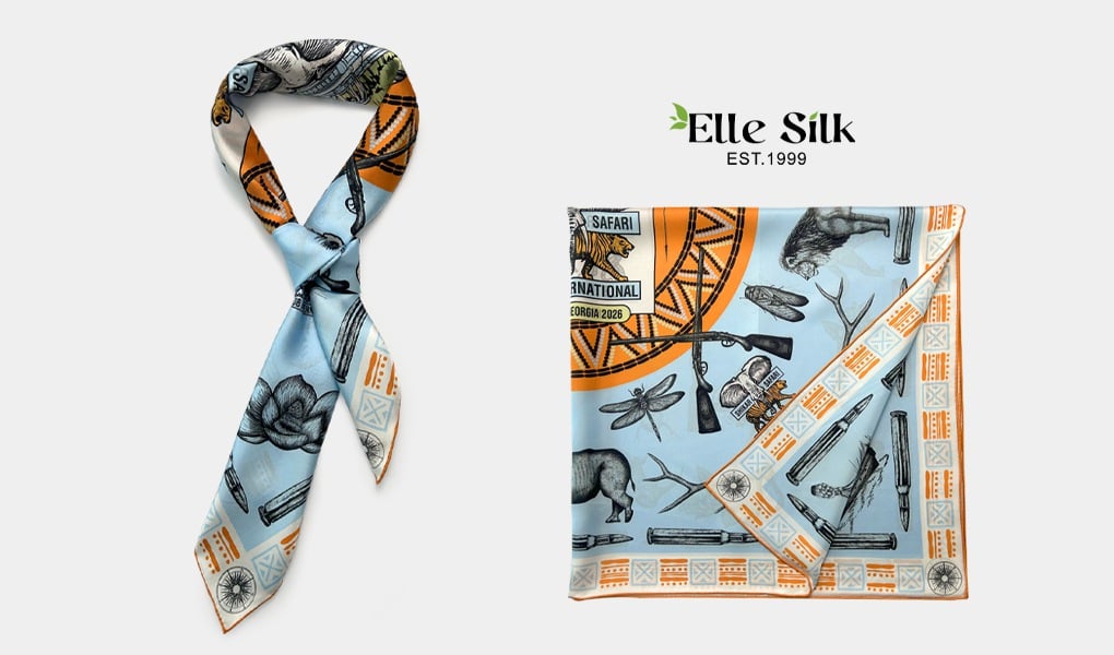
Double-sided printed scarves are elegant, refined fashion accessories—but their design and production process is significantly more complex than standard single-sided scarves.
One of the most common challenges arises already at the design stage: how should artwork be correctly prepared for both sides of the fabric, and how will it actually appear in the final product?
A major source of issues is not aesthetics, but misunderstanding the final visual outcome.
This article aims to clarify those misunderstandings and guide you through the two main design approaches, along with practical production insights.
First Things First: You Must Prepare Artwork for Both Sides
Unlike single-sided printing, double-sided printing requires two separate design files:
- Side A (typically the front)
- Side B (the back)
These can be:
- Two identical designs, or
- Completely different designs
Both approaches are valid, but they serve different purposes—and more importantly, they behave differently in production.
A Very Common Client Misconception
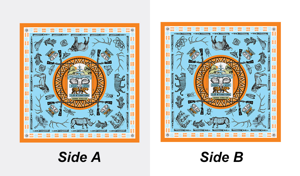
Many clients assume: If Side A and Side B use the same artwork, the final scarf will look perfectly identical and fully aligned on both sides. However, this is not correct.
✔ The actual production result is:
If Side A and Side B use the exact same unadjusted design file:
- The orientation of the two sides will be opposite
- The visual direction will appear reversed or mirrored in practice
- When worn (folded, draped, or flipped), this directional difference becomes even more noticeable
In other words:
👉 Same artwork ≠ same direction ≠ same visual result
This is one of the most frequently underestimated aspects in double-sided scarf production.
Want Both Sides to Look Identical? You Must Use a Mirror Design
If the goal is for both sides to appear visually identical and aligned in direction, the correct approach is:
✔ You must apply a mirror design
- Side A: original artwork
- Side B: horizontally mirrored version of Side A
This ensures:
- Consistent directional flow of the pattern
- A visually balanced and symmetrical appearance
- A more refined, luxury-level aesthetic outcome
Especially in silk scarves—where the fabric naturally moves, folds, and twists—mirroring is essential for achieving visual harmony.
A. No Text in the Design? Use a Mirrored Image
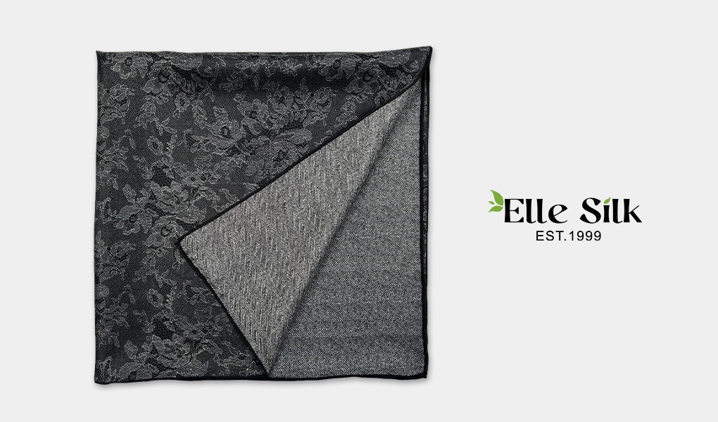
If your design consists purely of illustrations, patterns, or graphics—with no text—then the best approach is to make Side B a horizontal mirror of Side A.
Think of it this way: if Side A shows a bird flying from left to right, Side B should show the same bird flying from right to left—like a reflection in a mirror.
Why mirror the design?
Because scarves naturally fold, flip, and drape when worn. If both sides show the pattern in the same direction, it can look visually off-balance. A mirrored design creates symmetry and harmony, making the scarves look beautiful from all angles. This is especially important for luxury products or designs that emphasize refined aesthetics.
B. Design Includes Text? Mirroring Isn‘t Enough
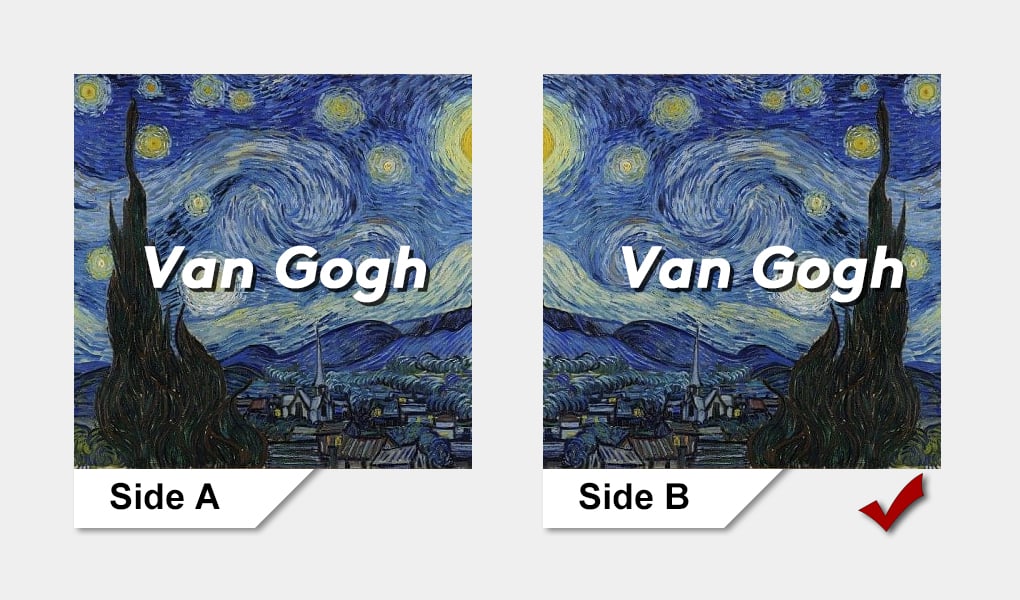
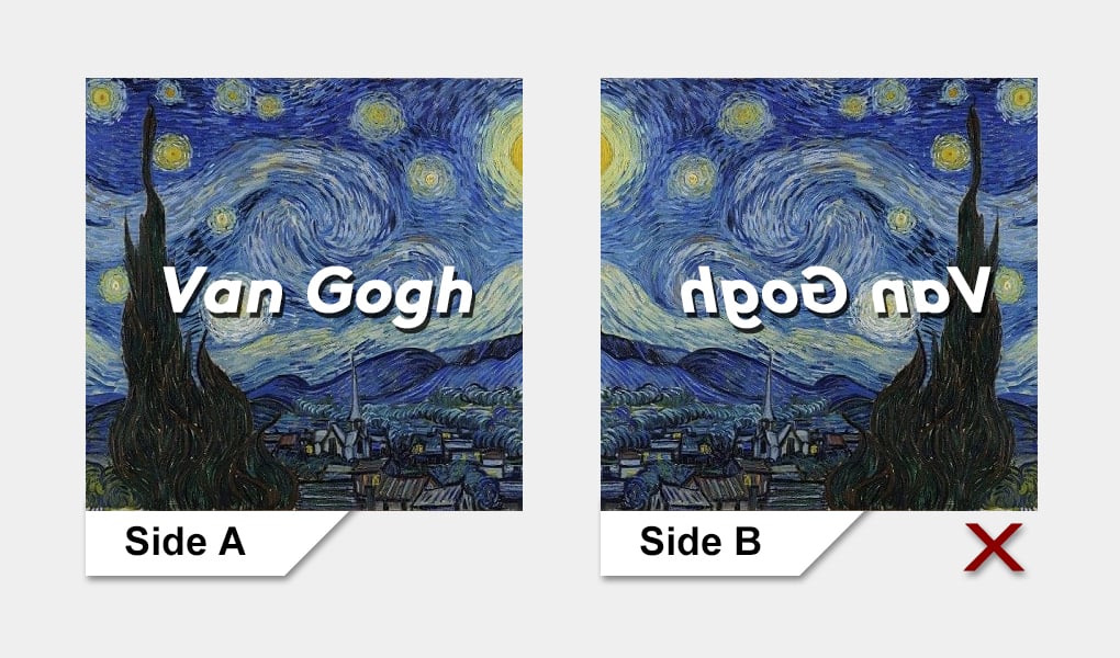
When your artwork includes text, simply mirroring the design can cause issues—such as reversed, unreadable lettering.
Here’s how to do it right:
- Mirror the graphic elements to maintain symmetry
- Manually reposition and retype all text on Side B to ensure it reads correctly
- Submit Side B as a separate, fully adjusted file, not just a flipped copy of Side A
This extra step takes more effort, but it’s essential for preserving both the functionality and beauty of your scarf design. It’s a must for high-end results.
Additional Important Recommendation: Avoid or Minimize Text Usage
Beyond the technical handling described above, it is also strongly recommended that clients reconsider the use of text in double-sided scarf designs.
Why?
Text introduces several risks:
- It can become unreadable when the scarf is flipped or folded
- It is more sensitive to bleed-through effects
- It reduces visual flexibility in double-sided compositions
Recommended approach:
- Avoid text whenever possible
- If necessary, keep it minimal and small
- Use short words, logos, or subtle branding elements only
This ensures that even if slight bleed-through occurs, it will not significantly affect the overall visual quality.
Designing Two Totally Different Sides? Great—But Watch for Color Bleed
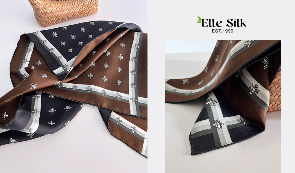
You can also treat the two sides as completely independent canvases. This opens the door to bold contrasts and creative themes—for example, a playful floral on one side and a minimalist color block on the other, or patterns representing two seasons or moods.
With this approach, mirroring isn’t necessary. Simply submit two different artwork files.
But be careful: while the designs are separate, the colors are not. Most scarves are made of lightweight silk or silk-like fabrics. This means strong colors on one side can show through to the other—a phenomenon known as “bleed-through” or “ghosting.”
For example:
If Side A is a delicate pink floral and Side B is a deep navy geometric pattern, the dark shapes may show through under bright light, affecting the purity of the floral design.
The more contrast, density, or saturation in your design, the more visible the bleed-through. Even with advanced double-sided digital printing technologies, such as precision inkjet alignment, bleed-through can only be minimized—not fully eliminated.
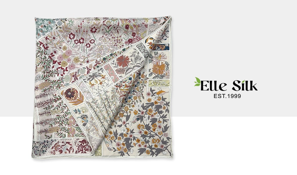
To manage this, keep these tips in mind:
✅ Avoid large dark or high-contrast areas on Side B
Especially if Side A is light, white, or delicate—deep tones on the reverse can disturb the clean look of the front.
✅ Use “visual compatibility” in your color choices
Even if the designs differ, keeping the tones or styles complementary helps soften any bleed-through, turning it into a layered effect instead of a flaw.
Quick Reference Chart: Which Scarves Design Strategy Works Best?
| Design Type | Mirror Design Recommended? | Why? |
| Completely different designs on each side | ❌ No | Independent concepts—mirroring not needed, but watch for color bleed |
| Same design, no text | ✅ Yes | Mirroring creates symmetry and better visual flow |
| Same design, with text | ✅ Partial Mirror + Manual Text Layout | Graphics can be mirrored; text must be re-set for readability |
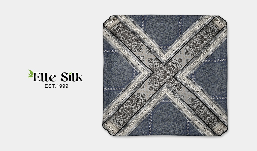
The beauty of a double-sided scarf lies in the fact that it’s never just “two sides of a print.” It’s a test of direction, balance, and even how we read visuals and text. Designing one is not just about duplicating a picture—it’s about imagining how that image moves, folds, and lives on a flowing piece of fabric.
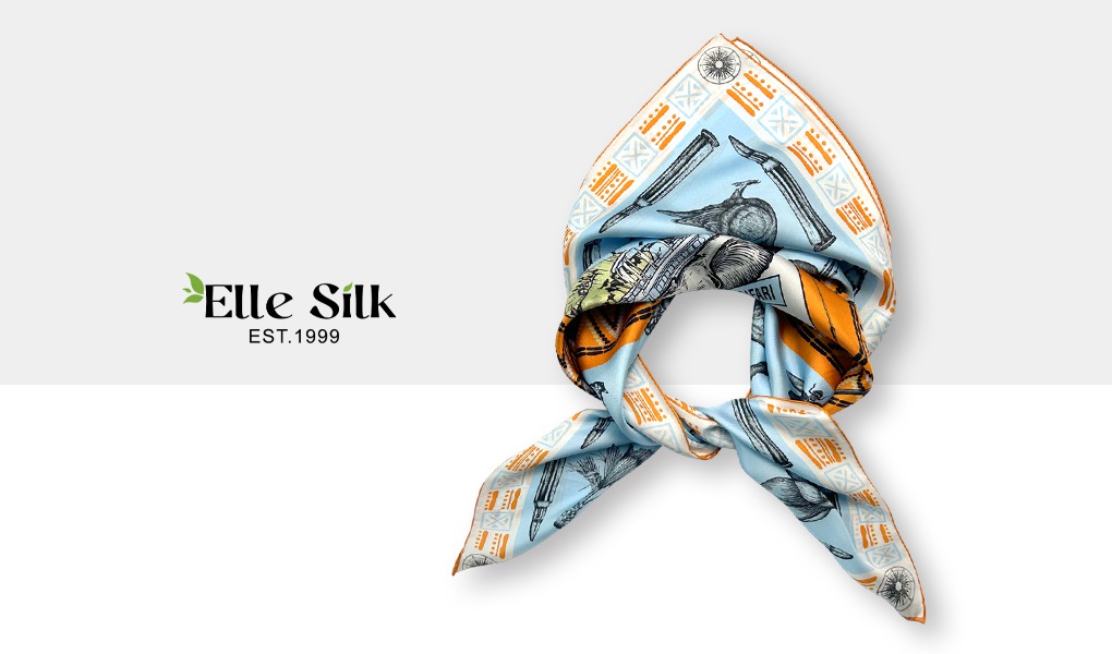
Great design is never accidental.
Behind every exquisite accessory lies not just inspiration, but technical understanding. Mirror or mismatch? Symmetry or contrast? These are choices made long before the scarf is worn—but they define how it looks in that moment.
So next time you design a double-sided scarf, slow down—and treat the back side as a star in its own right. Because in truly thoughtful work, the front is never the only side that matters.