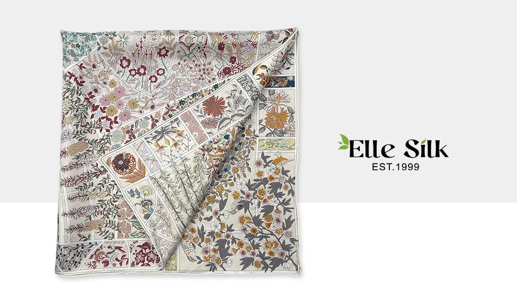
There’s something magical about double-sided silk scarves. Like a reversible jacket for the soul, it offers the wearer two moods, two voices, two stories—folded into one elegant accessory.
But here’s the catch: when it comes to double-sided printing on silk, what looks good on screen doesn’t always look great in real life. A recent project reminded us of this in the most unexpected way.
When Opposites Clash
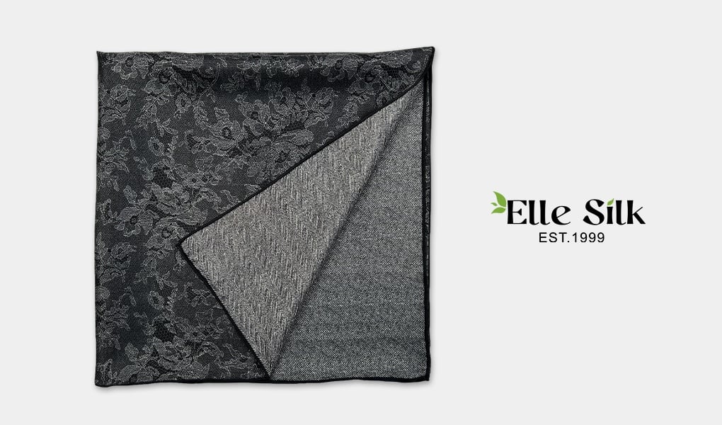
One side of the scarf was crisp and minimal: a white background with a centered logo, clean and timeless. The other side? A bold black field, densely patterned with a repeating motif. Visually striking. On paper, perfect.
In reality? Not so much. Once printed, the black from the reverse side subtly bled into the white front—turning the “pure” face of the scarf into something a bit murky. It wasn’t a printing error. It was physics.
Silk, especially high-quality charmeuse, is a naturally semi-transparent fiber. Color on one side almost always affects the other. The greater the contrast between the two sides, the greater the chance that each will interfere with the other.
Color Has a Personality
Think of color as having character traits:
- White is sensitive. It reflects everything and absorbs very little, which means it’s easily tinted by whatever lies beneath or behind it.
- Black is dominant. It takes up space, absorbs light, and rarely plays nicely with others.
- Grays and neutrals are diplomatic. They blend, soften, and help everything get along.
So when designing a double-sided scarf, it’s worth thinking not just in terms of aesthetic contrast, but also in terms of how your chosen colors “behave” together—like housemates sharing a very thin wall.
A Double-Sided Scarf Is Not Two Scarves
Here’s a common misconception: that double-sided printing silk scarves are like designing two separate scarves back-to-back. In reality, it’s more like a conversation between two personalities who happen to share the same skin.
Just as you wouldn’t line a sleek navy overcoat with neon green (unless chaos is the goal), the two faces of a silk scarf need harmony, not conflict. It’s not about making each side louder—it’s about making sure they speak the same visual language.
Design Tips That Actually Work
If you’re planning a double-sided silk scarf—whether as a brand project, alumni gift, or art piece—here are a few principles to guide your color choices:
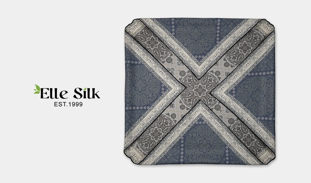
- Avoid extreme contrasts. Black and white is a classic pairing, but on silk, it often backfires. Instead, consider softer combinations like slate and ivory, blush and taupe, or navy and smoke gray.
- Think in families. Use variations of the same color (light and dark versions, matte and glossy treatments, pattern density) to create depth without dissonance.
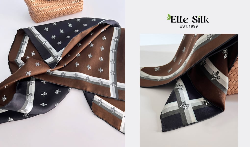
- Design for conversation, not competition. Let one side lead, and the other respond. For example, a dominant logo on one side can be echoed by a smaller, repeating motif on the other.
Art, Meet Physics
At ELLESILK, we believe that the beauty of silk lies not just in its elegance, but in its honesty. It doesn’t hide much. And that’s part of the charm.
Designing for double-sided silk is like writing a duet: both voices need to be in tune. With the right approach, your scarf won’t just look good—it’ll feel balanced, considered, and worthy of the story it tells.
So go ahead—dream big, design boldly. Just don’t let one side outshine the other.