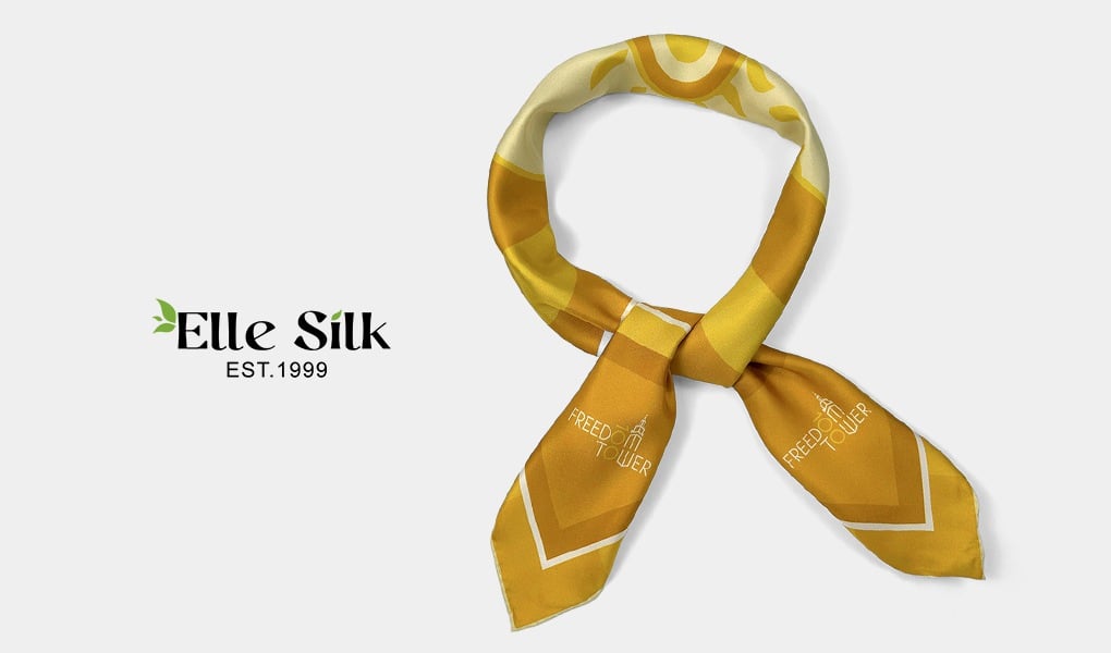
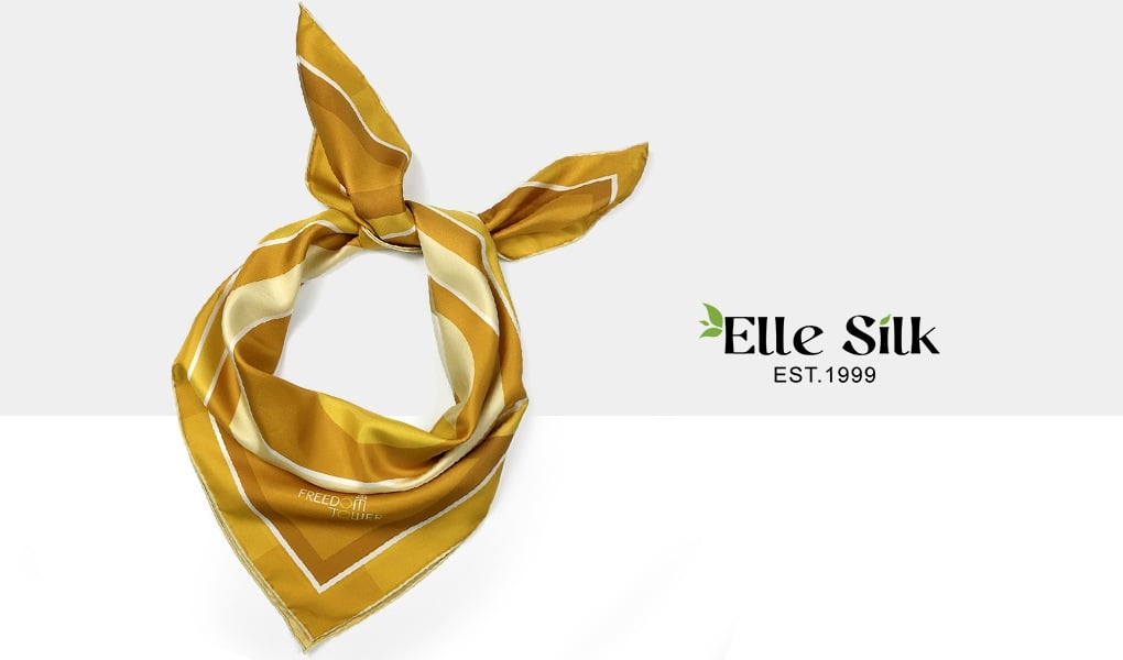
In custom silk scarf production, one question comes up repeatedly: What does the back look like if the scarf is printed on only one side?
The answer is straightforward: It will not be pure white, and it will not be identical to the front.
That outcome is determined by fabric structure and printing physics.
Why Print-Through Happens
Whether produced by digital printing or dye sublimation, the process relies on heat to bond dye molecules to the fibers.
Silk and similar lightweight fabrics share three characteristics:
- A fine, lightweight weave
- Fiber structures that allow dye penetration
- Natural light transmission through the fabric
Dye does not sit only on the surface. It penetrates into the fiber structure. As a result, a softened version of the design becomes visible on the reverse side.
In the textile industry, this is referred to as print-through. It is a material property.
Dark vs. Light Designs: What Changes
The degree of print-through is influenced primarily by color saturation and fabric weight.
Dark or High-Contrast Designs
With black, navy, burgundy, or other high-saturation colors:
- The reverse typically shows 60 – 80% of the front’s visual intensity
- Black often appears charcoal on the back
- Fine lines soften slightly
- Large dark areas become more diffused
When examined flat, the difference is clear; When worn, the visual impact is generally minimal.
Light, Pastel, or Watercolor Designs
With lighter palettes or gradient artwork:
- The reverse retains approximately 75 – 90% of the front’s appearance
- The contrast difference is less pronounced
- The overall effect appears softer rather than faded
Low-contrast or watercolor styles tend to perform particularly well in single-sided printing.
The Role of Fabric Weight
Fabric weight significantly affects visual outcome:
- 8–12 momme silk: more visible penetration
- 14–16 momme silk: clearer distinction between front and back
- Heavier satin or dense polyester: lighter reverse appearance
Thinner fabric allows more light transmission, while heavier fabric increases front-to-back contrast.
This is structural, not incidental.
Is Print-Through a Quality Issue?
No.
In lightweight silk production, dye penetration into the fiber is inherent to the process. A softened reverse does not indicate a defect.
If the following conditions are met:
- Front-side color saturation matches design intent
- Edges remain sharp
- Color fixation is stable
Then a muted reverse is considered normal.
To achieve near-identical saturation on both sides, manufacturers must either:
- Increase fabric weight
- Or use double-sided printing
In standard lightweight silk scarf production, visible difference between front and back is expected.
When Is Double-Sided Printing Necessary?
Double-sided printing silk scarf is not a higher grade of production. It is a response to specific design requirements.
It becomes relevant when:
- The silk scarf must function as fully reversible
- The reverse side requires high-contrast clarity
- Visual consistency on both sides is a defined brand requirement
- The product concept emphasizes structure over lightness
Double-sided production involves:
- Two independent color applications
- Precise alignment control
- Greater technical complexity
Costs typically increase by 40 – 80%, depending on scale and construction.
It is a design decision, not a corrective measure.