
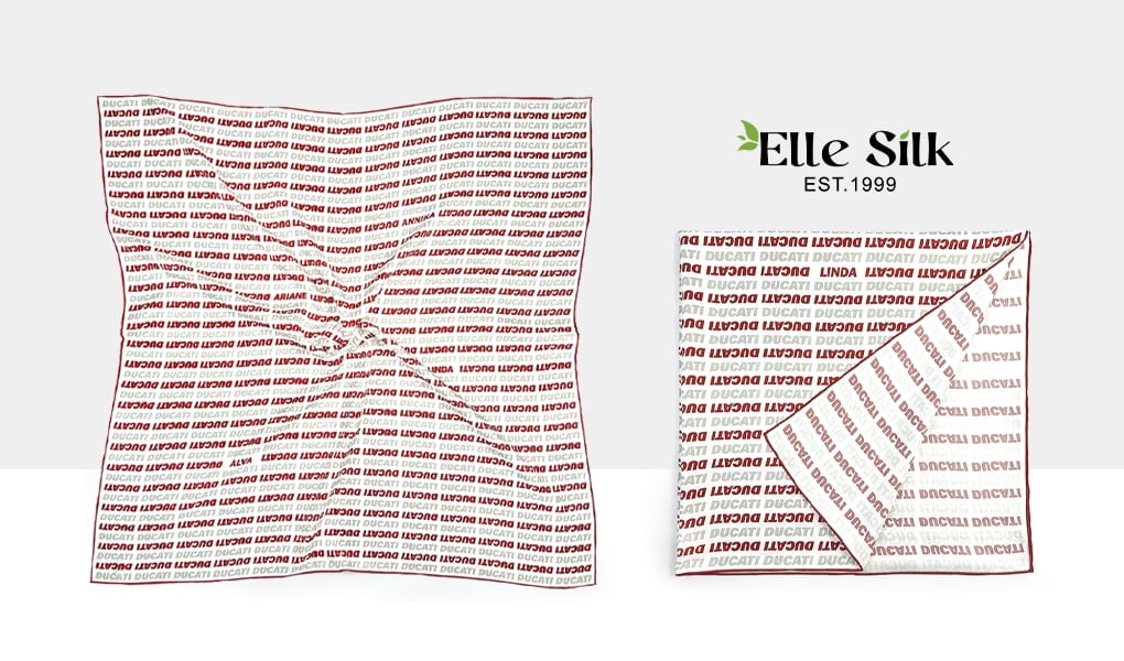
When ordering custom silk scarves, one question comes up quite often: what does the reverse side of a single-sided print actually look like on silk twill? Most customers do not expect the back to look identical to the front. What they really want to know is whether the reverse will remain close to the natural white of the silk or show noticeable color, how much of the color will penetrate the fabric, and how clearly the original design will still be visible.
This is difficult to judge from a digital mockup because a mockup only shows the printed face of the scarf. The reverse side of the actual fabric is created in a different way: the dyes applied to the front penetrate the silk fibers and pass through the fabric to varying degrees. As a result, the reverse of a single-sided print is usually neither blank white nor a second copy of the front. Instead, you see the front design in reverse, with softer color, reduced contrast, and less definition in some details.
Exactly how light it will look, and how clearly the design will show through, varies from one design to another.
First, Look at Real Front-and-Back Comparisons
Below are some real examples of single-sided printing on silk twill, showing the front and reverse sides side by side.
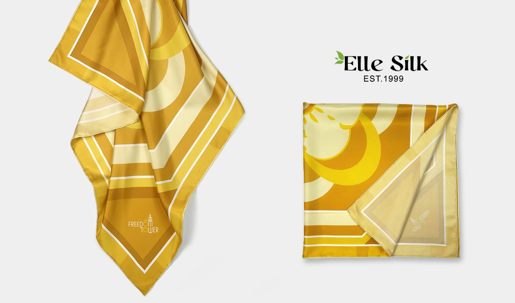
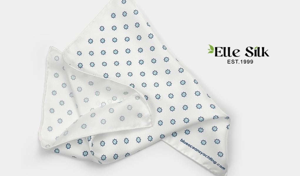

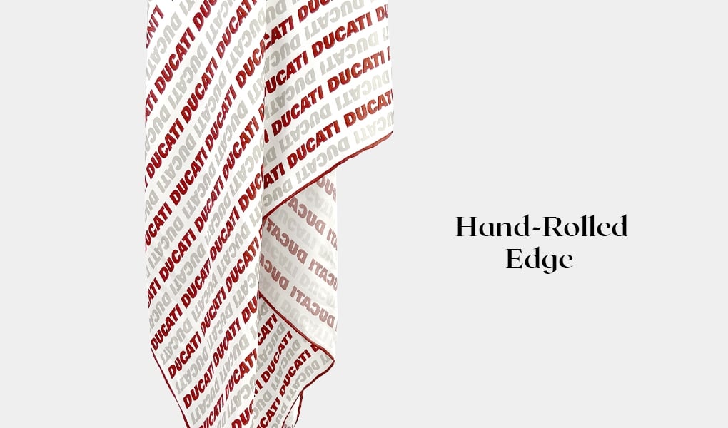
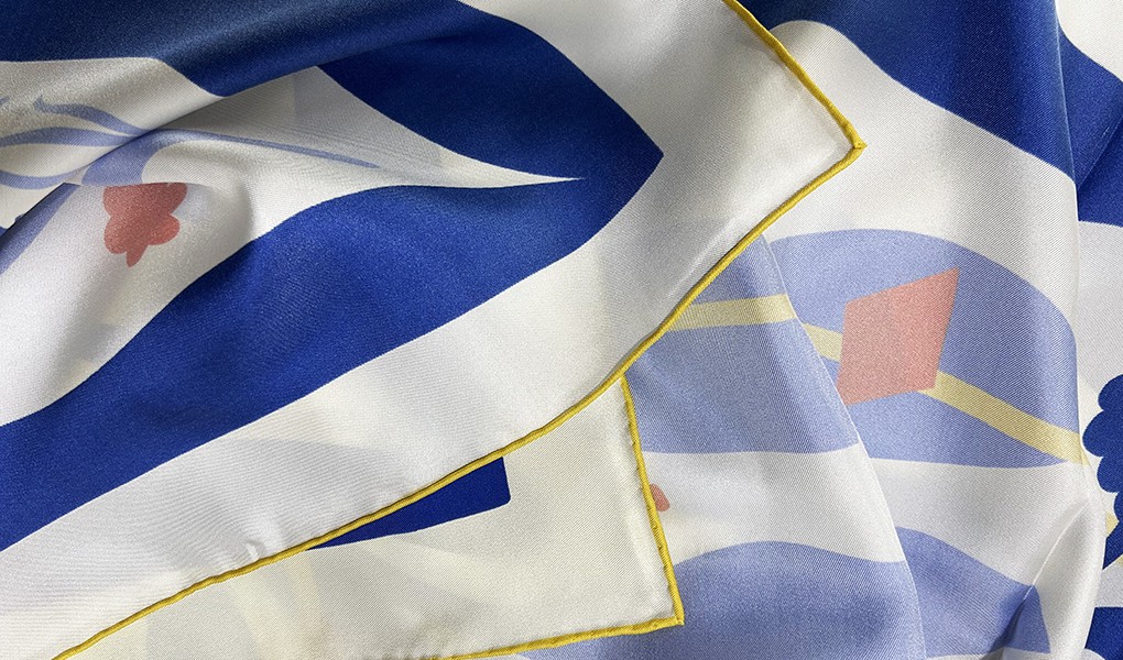
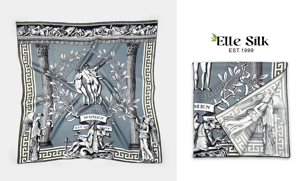
Looking at several scarves together is much more useful than trying to judge one color in isolation. In some designs, the main color areas and motifs remain quite easy to recognize from the reverse. In others, the overall appearance becomes noticeably softer. Even within the same scarf, one area may show through quite strongly while another color, fine line, or small detail becomes much less visible.
The important point is not simply that the reverse is lighter than the front—that is a natural characteristic of single-sided printing. What matters is that the entire design does not become lighter at the same rate. If you take the front artwork into Photoshop and simply reduce its opacity, every part of the image changes according to the same rule. Real printed silk does not behave that way.
This is also why we cannot say that black will always turn into a particular shade of gray on the reverse, or that red will always become a particular shade of pink. Even two areas that both appear black in different designs may look different on the reverse because of their actual color values, the amount of dye, the size of the printed area, and the surrounding colors.
Why Do Some Colors Show Through More Than Others?
The fabric itself is one of the first factors. The type of silk, its weave, and its weight all influence how dye travels through the fabric and how much color is visible from the other side. In general, lighter and more open silk constructions tend to show more color on the reverse, while heavier or more tightly woven fabrics tend to create a more noticeable difference between the two sides.
Silk twill has some weight to it and a relatively dense twill structure, so its reverse should not be expected to look the same as that of a very lightweight, open silk fabric. The colors on the printed face can be rich and saturated, while what you see on the reverse is the result of those dyes passing through the silk fibers and twill structure.
Fabric, however, is only one variable. Even on the same silk twill, the printing method, dye penetration, artwork colors, color coverage, and finishing can all influence the appearance of the reverse. This is why describing the back with one fixed percentage rarely tells the whole story.
The artwork itself also plays a larger role than many people expect. A large dark background and a very fine pale line can exist in the same design, yet their print-through may look completely different from the reverse. The lightness and saturation of a color, the size of the printed area, and its contrast with neighboring colors all affect how strongly we perceive it from the back. Technical dye penetration and the visual impression of the reverse are related, but they are not exactly the same thing.
How Clear Is the Design on the Reverse?
In many cases, this is more useful to consider than simply asking how much color shows through.
If the front contains large color areas, florals, or shapes with strong outlines, the main forms can often still be recognized easily from the reverse even when the colors are softer. Fine lines, small decorative elements, low-contrast patterns, and tiny text, however, may become much less noticeable.
So, visible color on the reverse does not mean that every detail from the front will be reproduced with the same clarity. Color penetration and image definition are two different things. An area can have substantial color showing through while the crisp edges and subtle details visible on the front become softer on the reverse.
This distinction also matters when the scarf is actually being worn. People rarely inspect a scarf from just a few centimeters away. More often, the reverse appears naturally through folds, knots, and movement. When evaluating the back, it therefore makes sense to consider both close-up detail and how recognizable the overall colors and pattern remain at a normal viewing distance.
Why Are Text and Logos Mirrored on the Reverse?
This is a simple characteristic of single-sided printing, but one that can easily be overlooked during the design stage.
Suppose the front of the custom silk scarf contains the letters ABC. As the dye penetrates the silk and becomes visible from the opposite side, you will not see a lighter version of “ABC” in the same reading direction. You will see a mirrored version of it. The same applies to logos, numbers, and any other directional elements.
The reason is straightforward: the design on the reverse has not been printed a second time. The color you see there comes from the dye on the front passing through the silk fibers. This is also why seeing color and pattern on the reverse does not mean that the scarf has been double-sided printed.
Can You Simply Use More Dye to Make the Reverse Darker?
It is not quite that simple. The color on the reverse comes from dye penetrating into and through the fabric, but that does not mean that using more dye will automatically produce a better reverse side.
The printing process first needs to maintain the color, edges, and details of the design on the front while preserving the natural hand and drape of the silk. Trying to force a darker reverse simply by increasing the amount of dye can affect color control and print definition, and may also influence the soft feel of the fabric. The darkness of the reverse therefore should not be treated as an isolated target separate from the appearance of the front and the hand of the silk.
This is also an important point when looking at real examples. The goal is not to find which scarf has the darkest reverse, but to understand how color, artwork, and silk come together in a single-sided print and what kind of balance they create in the finished scarf.