I recently got my hands on a silk scarf that doesn’t try to impress you at first glance. It’s not the type that jumps out on a shop wall or screams “limited edition.” But the more I looked at it, the more it grew on me — until I realized I was inspecting every little edge, and thinking: wow, this one’s really well made.
This silk scarf isn’t flashy. No bold logo, no loud color blocking. But it quietly holds your attention — and earns it.
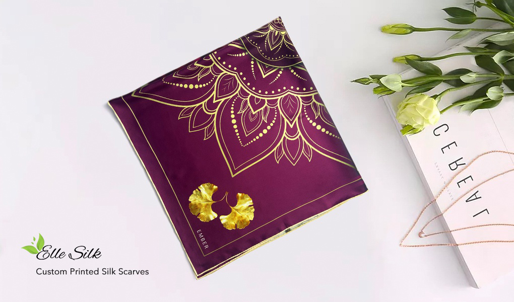
The Color Story: Deep Purple with a Hint of Gold
The base color is a rich, slightly cool-toned purple. Not lilac, not plum — it sits somewhere deeper, calmer, a little moody even. And on top of that, fine gold lines are printed with just the right amount of shimmer. Not glittery, not yellow-gold — but a subtle metallic ink that shifts under the light, like a piece of jewelry catching the sun.
The whole pattern is carefully laid out — symmetrical, but not rigid. Decorative, but never busy. There’s room to breathe.
Craftsmanship Hiding in the Details
What really sold me on this silk scarf, though, was what’s happening at the edges.
That gold print? It’s not your standard flat ink. Getting that soft, brushed metallic finish requires real precision — especially on silk. The lines are clean, the reflections soft and dimensional. This tells me someone behind this piece actually cared about how it would feel when you looked at it up close.
And then there’s the rolled edge, done by hand. The hem curves naturally, almost invisibly stitched — not stiff or mechanical like mass-produced versions. It gives the silk square scarf a softness and structure that machines just can’t mimic.
But here’s what I loved most: the hem is finished in a beige thread — a warm, muted tone that contrasts gently with the purple base. It’s a subtle visual frame, brightening the edge just enough to add clarity and polish, without drawing attention away from the main design.
It’s a small detail, but one that changes everything.
These kinds of pairings — deep color with a soft contrast — are underrated. Think purple and beige, forest green with silver-grey, or cobalt with caramel brown. Unexpected at first, but incredibly sophisticated when done right — especially on something like a scarf, where contrast can highlight the shape and add dimension in the subtlest way.
The Kind of Piece That Just Works
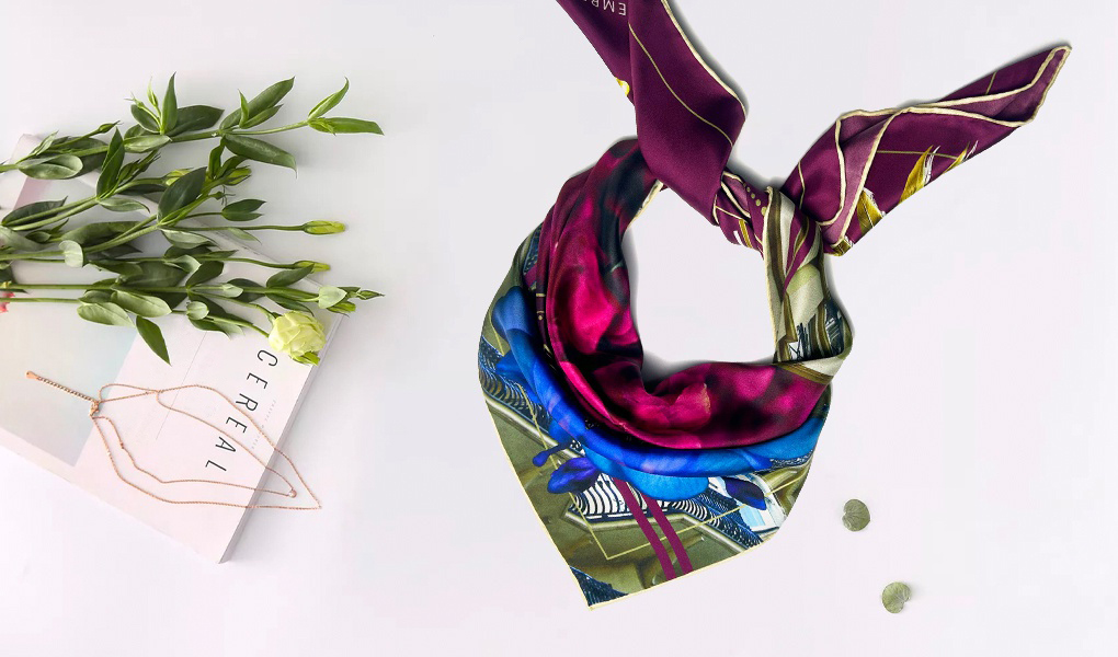
What I love about this scarf is how effortlessly it fits into different styles. You can knot it around your neck with a simple white tee and instantly elevate the look, or loop it onto your handbag for an understated but elegant detail. It also works beautifully as a headband, a loose shoulder drape, or even wrapped around your wrist.
If you have cooler undertones, the deep purple really flatters the skin — it brings out a translucent glow. But even warmer tones can pull it off by pairing it with ivory, caramel, or camel tones.
I’ve even worn this scarf with just a tee and jeans — and somehow, that one accessory made the whole outfit look like I’d planned it out. That’s the kind of piece this is.
The Wrap-Up
This scarf doesn’t rely on shock value or obvious trendiness. But from color to material to finishing, every choice feels intentional — and confident.
It doesn’t fight to be the center of attention, but it doesn’t disappear either. It simply completes the picture.And that, to me, is the essence of quiet luxury:
Thoughtful design, honest materials, and details that don’t need to shout — because they’re already doing their job beautifully.