
Why Morandi Colors + Silk Sheets Work So Well for Fall
As the air turns crisp and the light softens, fall is the perfect time to create a bedroom that feels calm, cozy, and refined. This year, we’re leaning into two of the season’s biggest design obsessions: Morandi-inspired palettes and the soft glow of pure silk sheets.
Morandi colors—named after the Italian painter Giorgio Morandi—are all about muted, smoky tones with soft undertones of gray, beige, mauve, and sage. They have a calming, lived-in quality that instantly slows down a space without feeling dull. Pair that with the quiet luster of silk sheets—cool to the touch yet naturally insulating—and you’ve got a bedroom that’s all about tactile richness and understated elegance.
The 2025 American Bedroom Trends Behind the Look of Silk Sheets
What makes this combo more than just pretty? It taps right into the biggest design shifts happening now:
| Trend | What It Means | Why It Works with Morandi Silk |
| Quiet Luxury | Understated design with rich materials and minimal branding | Silk + subtle color = visual softness with high-end texture |
| Emotional Spaces | Rooms designed to soothe, ground, and uplift | Morandi tones reduce visual noise and invite stillness |
| The Return of Earth Tones | Warm neutrals like clay, olive, and sienna are replacing cool grays | Morandi’s muted warmth plays right into this shift |
| Biophilic Design | A focus on natural materials and organic textures | Silk pairs beautifully with wood, stone, linen, and wool |
4 Fall-Forward Color Stories Using the 60-30-10 Rule
(60% background, 30% main elements like bedding, 10% accent pieces)
These palettes use silk sheets as the anchor. Feel free to adjust for your light, floor, or mood—but start here for foolproof harmony.
1. Soft Sage Serenity
- 60%: Walls in a sage-gray blend (Benjamin Moore “Healing Aloe”)
- 30%: Silk sheets in misty green-gray
- 10%: Brushed gold lamps, unglazed ceramic vases
✔ Best for: Small urban bedrooms needing a breath of calm
2. Clay & Cocoa Warmth
- 60%: Clay-toned walls (like a faded terracotta)
- 30%: Silk bedding in mink brown or muted mocha
- 10%: Burnt orange velvet pillows, matte black bedside lighting
✔ Feels: Hugged, grounded, subtly dramatic
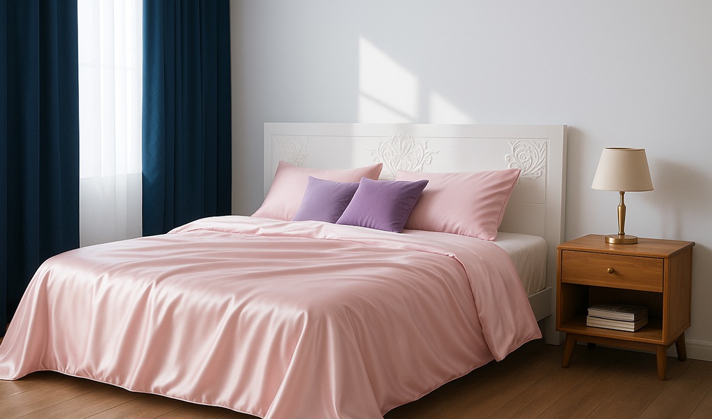
3. Smoky Lavender Romance
- 60%: Smoky lilac or pale plum on walls
- 30%: Dusty mauve silk bedding
- 10%: Wool rugs in mushroom gray, alabaster table lamps
✔ Adds: A feminine yet moody softness that feels timeless
4. Blue Fog Minimalism
- 60%: Walls in dusty slate blue
- 30%: Light gray-blue silk sheets
Layering Tips to Elevate the Look
- Mix Your Textures
- Pair the smooth sheen of silk with rougher, matte finishes like linen curtains, oak wood frames, or chunky knit throws.
- Add contrast through “warm hard / cool soft” combinations—think solid wood headboards with silk pillowcases.
- Pair the smooth sheen of silk with rougher, matte finishes like linen curtains, oak wood frames, or chunky knit throws.
- Light Temperature Matters
- Use 2700K–3000K warm white LEDs to keep the glow cozy and flattering.
- Avoid strong blue light which can flatten color richness—choose linen or frosted glass shades to diffuse it.
- Use 2700K–3000K warm white LEDs to keep the glow cozy and flattering.
- Walls as a Soft Canvas
- Opt for low-sheen, chalky paints or microcement finishes to let the silk gently pop.
- Try color-wrapping—painting the ceiling and walls in one tone—to create a cocooning, gallery-like feel.
- Opt for low-sheen, chalky paints or microcement finishes to let the silk gently pop.
- Make It Sustainable (and Stylish)
- Choose OEKO-TEX® certified silk sheets
- Look for FSC-certified wood, mineral-dyed textiles, and recycled brass accents to keep things conscious and clean
- Choose OEKO-TEX® certified silk sheets
No trends. No noise. Just layered texture, light, and color that make sense—visually, emotionally, and seasonally.
That’s how I design for fall. That’s how your bedroom should feel.